sorry i haven't updated in awhile guys...been on vacation in NY/Boston.
with the elections coming up, i decided to show you guys a cool infographic on where political campaigns get the bulk of their funding. GOOD took the top grossing campaigns of 1 democrat and 1 republican and displayed them as race car drivers, emblazoning their jackets with the logos of their biggest contributors. enjoy!
Ramblings of a retired elite gymnast. Design and sports obsessed account planner. Founder of the Non-Profit AnonyMouse.
Friday, October 29, 2010
Friday, October 22, 2010
get hyphy
did you ever want to know how every rap name is tied to another? well look no further, Pop Chart Lab has done just that...it's actually pretty awesome slash hilarious.
my favorite:
BIG - Big Boi, Big Pun, Big Daddy Kane, Notorious B.I.G. --- Biggie Smalls --- SMALL - Too Short
click the picture for a close up.

my favorite:
BIG - Big Boi, Big Pun, Big Daddy Kane, Notorious B.I.G. --- Biggie Smalls --- SMALL - Too Short
click the picture for a close up.

Thursday, October 21, 2010
the american dream
ever wondered what it would be like to participate in the creation of a new community?
LA's Skirball Cultural Center is doing exactly that with the help of the British Theater Company Subject to Change, called "Home Sweet Home". Museum visitors get to influence what gets built, who lives where, and what business are allowed in. Here's an excerpt from GOOD:
Visitors were of course drawn to the beach and to Hollywood. Watts Towers was decorated but no one moved into the neighborhood. Participants created numerous business and civic ventures: movie theaters and coffee houses; organic farms and food stores; an art gallery complete with miniature paintings; a hospital, and an In-n-Out burger fashioned from a banana. Unsurprisingly, high-schoolers contributed a marijuana dispensary. And as further evidence of Angelenos' political passions, protests were organized against everything from the BP oil spill to a fish shop that was selling whale meat.
It's a very interesting concept that obviously invites the discussion of immigration (especially given that it's LA). Without getting into the politics, here are some numbers on the impact and magnitude of immigrants in the US:
Interesting to note that Nevada has a higher percentage of their labor force that is illegal than California does.
Wednesday, October 20, 2010
relationships of all shapes and sizes
ever wonder how monogamy, polygamy, and everything in between interact with one another? well neither have i! but here's all you ever wanted to know (and probably more) anyway:
my hero david mccandless and his partner in crime laura sullivan created this awesome infographic 2 years ago for his book "The Visual Miscellaneum" (click for full sized images)

He's since updated it with help from Franklin Veaux (via QuietRiotGirl).
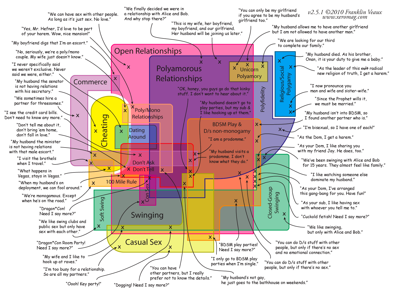
Enjoy!
my hero david mccandless and his partner in crime laura sullivan created this awesome infographic 2 years ago for his book "The Visual Miscellaneum" (click for full sized images)

He's since updated it with help from Franklin Veaux (via QuietRiotGirl).

Enjoy!
Tuesday, October 19, 2010
green brands
yet another inspiring yet creative GOOD infographic. what importance do consumers place on the "greenness" of a company? and which countries care more about this than others?
(click the image for a blown up version)

(click the image for a blown up version)

Monday, October 18, 2010
sausage factory
"everything you didn't want to know about sausages"
discretion advised...
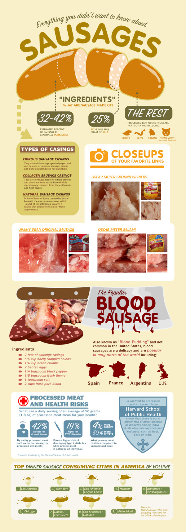
Infographic by Food Coupons
discretion advised...

Infographic by Food Coupons
Friday, October 15, 2010
the art of presenting
yesterday, I attended the RogenSi skills presentation training - an all day work session in my office aimed at helping people become better presenters. we learned my important things, but my key takeaways were:
* when referring back to a PowerPoint, follow the "touch-turn-talk" rule. glance at the screen (touch), face the audience (turn), and speak to them (talk)
* in presentation mode in PowerPoint, if you press "B" the screen will turn black and if you press "W" the words and images on the screen will disappear and the screen will turn white. simply press that button again to reactivate them. GENIUS
* there are 4 types of people you will present to in your life and you plan your presentations accordingly
Expressives - big picture. visionaries. high energy. dominant
Amiables - empathetic. team players. harmonious. uncomfortable with conflict.
Drivers - results oriented. BLOT (bottom line right on top). direct. concise
Analyticals - rational. pragmatic. data/detail oriented. risk averse. accurate
* when giving a conference call presentation, stand up and exaggerate your hand gestures to emphasize your words and relay your enthusiasm.
It was all very informative and i truly believe I am a better presenter because of it. in attempting to find a way to relate just how important being a good presenter was, i stumbled across this article from CNN.
Why we hate PowerPoints -- and how to fix them
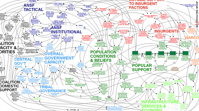
Nancy Duarte, CEO of Duarte Design, a presentation design firm based in Mountain View, California explains the importance of a good presentation, why utilization of PowerPoint is important, and examples of how it's made or broken good and bad ideas. She brings up the examples of the army, Enron, and NASA. Re: the army, check out this infamous "presentation" of US strategy in Afghanistan. clear right?

Thursday, October 14, 2010
the world of data
i'm sure many of you have wondering this at one point or another. well look no further, GOOD has compiled a beautiful visualization on how much data we create or consume whether it be email, tweets, downloads, etc.
check it out here for the full sized image.

check it out here for the full sized image.

Wednesday, October 13, 2010
calling all infographers!
GOOD is hosting a competition to see who can come up with the best infographic for the upcoming election.

Here is the deets:

the OBJECTIVE
Create an infographic about the 2010 midterm elections.
Create an infographic about the 2010 midterm elections.
the ASSIGNMENT
For this contest, we're looking for infographics about who is running, who is voting, who is paying for campaigns; anything you can think of about the election.
For this contest, we're looking for infographics about who is running, who is voting, who is paying for campaigns; anything you can think of about the election.
the REQUIREMENTS
Please email us your submissions to projects[at]goodinc[dot]com with the subject "October 2010 Transparency Contest." It should be a JPG, exported at a high enough resolution that it can be printed at 300 dpi. Since we're a little pressed for time, we’ll take submissions now through October 24. As with our last contest, we'll be giving out three awards: best use and presentation of information, best aesthetics, and best overall infographic. The winning entries will be selected by GOOD and winners will be announced on October 27, featured on our homepage, and printed in the next issue of GOOD. We’ll send GOOD T-shirts and a free subscription (or gift subscription) to the winners.
Please email us your submissions to projects[at]goodinc[dot]com with the subject "October 2010 Transparency Contest." It should be a JPG, exported at a high enough resolution that it can be printed at 300 dpi. Since we're a little pressed for time, we’ll take submissions now through October 24. As with our last contest, we'll be giving out three awards: best use and presentation of information, best aesthetics, and best overall infographic. The winning entries will be selected by GOOD and winners will be announced on October 27, featured on our homepage, and printed in the next issue of GOOD. We’ll send GOOD T-shirts and a free subscription (or gift subscription) to the winners.
propagation planning
propga? what? if you're wondering what this is, so was i. Griffin Farley and Mike Monello, a planner at BBH and a founder of Campfire respectively explain the importance of word of mouth and influencers. oftentimes targeting those who influence your actual target is more effective that targeting your actual target.
for example: for the launch of the movie Coraline, propagation planning was used to create "Coraline Boxes" which were a collection of oddities, dolls, and props about the movie which were then sent to online "influencers" who would blog and share about it.
another example of propagation planning is the "Great Schlep" in which the Obama campaign targeted jewish grandchildren in attempts to convert their older grandparents. both were wildly successful.
take a look for yourself:
Tuesday, October 12, 2010
the true size of africa
stumbled across this gem from the good blog. funny that even though we are taught in high school about the disproportions in Mercator maps, many forget the sheer magnitude of said distortions. africa is effectively larger than the US, Europe, China, India, and Japan...combined. take a look:

view the blog here

view the blog here
Monday, October 11, 2010
Scale of the Universe
Some of you may have already seen this, but an updated version of "The Powers of 10" (any of you guys remember that video?)
The guys at Primax Studio take us from a Quantum Foam to the Observable Universe.
The guys at Primax Studio take us from a Quantum Foam to the Observable Universe.
How to Motivate
Dan Pink explores the value of intrinsic motivation at TED:
In it he compares a boss's motivation in the workplace to a mother's expectations after a Thanksgiving meal. Basically saying that putting any sort of dollar amount on that dinner would cheapen its value. In the same fashion, employees are better motivated with intrinsic manners over monetary ones. I think this is an excellent point, and that most successful business relationships extend beyond their dollar amount.
(thanks Nathan Adkisson)
Wednesday, October 6, 2010
map of online communities
visfound this clever little map from "design language news":
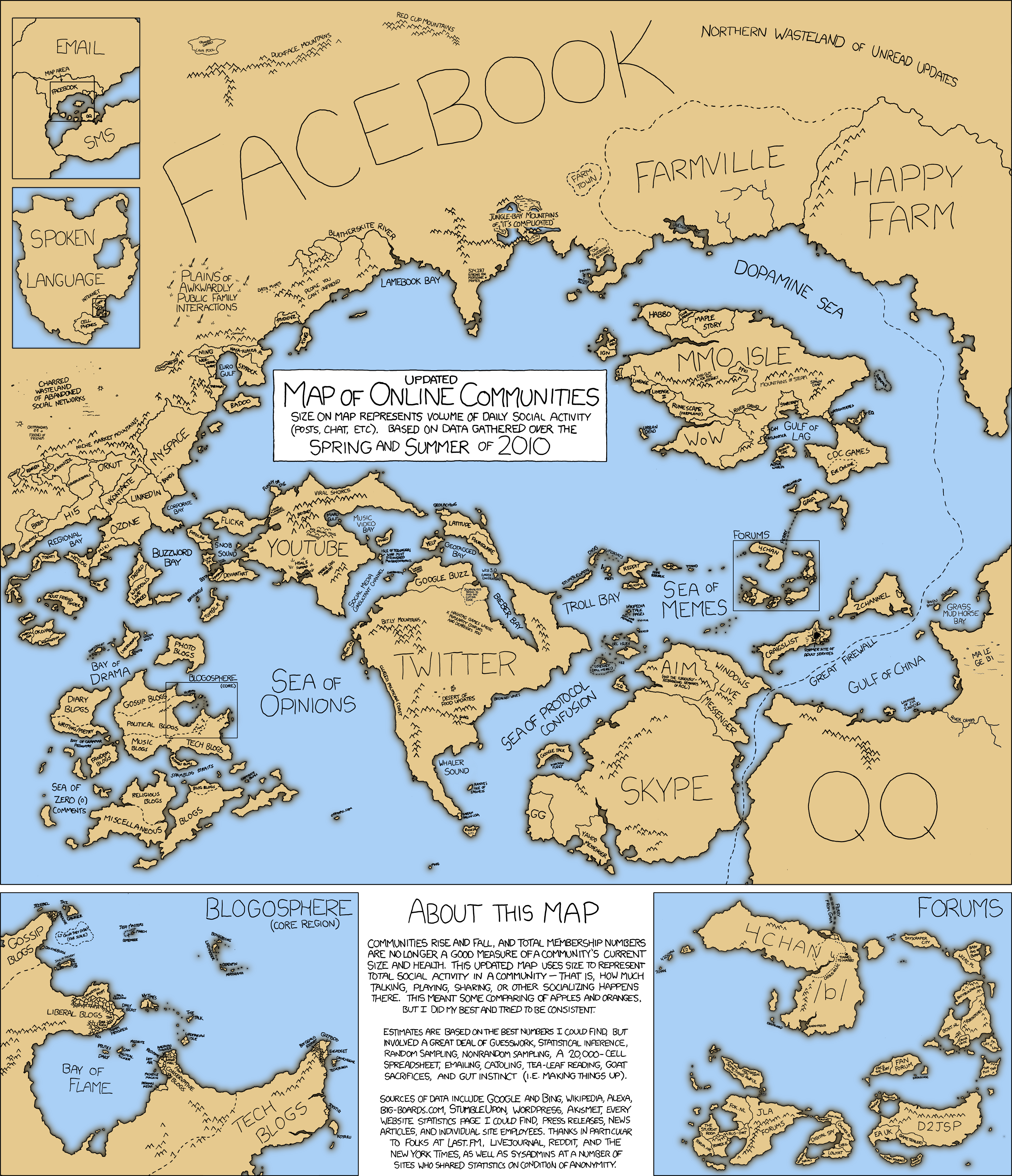
my favorite part is the "unethical bay" that's settled right in the south tip of the farmville region.

my favorite part is the "unethical bay" that's settled right in the south tip of the farmville region.
color me crazy
Who remember's playing with Crayola crayons? I distinctly remember tearing off their paper wrappings so that I could color using the sides of the crayons instead of just the tips. Why? I have no idea - I was a kid.
Anyway, if you're curious as to how the colors of Crayola have evolved over the years, here's a neat visual representation from "Weather Sealed"

Apparently, the number of colors doubles every 28 years! Rad!
Anyway, if you're curious as to how the colors of Crayola have evolved over the years, here's a neat visual representation from "Weather Sealed"

Apparently, the number of colors doubles every 28 years! Rad!
Tuesday, October 5, 2010
using the ipad to create content
a bloody brilliant article about how the ipad can be used not only to consume content, but to create content as well.
here are some videos from it demonstrating that:
Making Future Magic: iPad light painting from Dentsu London on Vimeo.
Enjoy! :)
here are some videos from it demonstrating that:
Making Future Magic: iPad light painting from Dentsu London on Vimeo.
Enjoy! :)
suing in the mobile space
a cool visual representation of who is suing who:
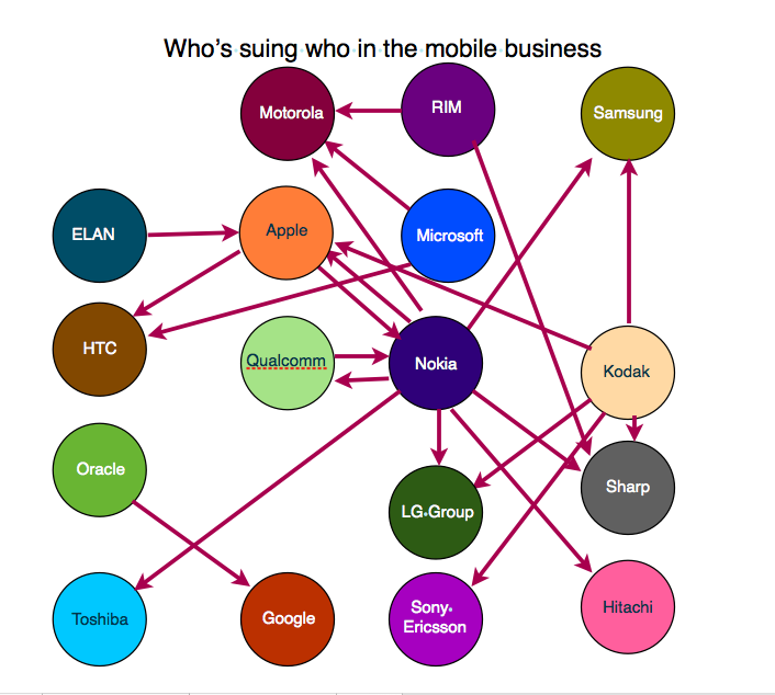
A few quick hitters:
- Nokia is the most active litigator, with 6 companies targeted, compared to 2 incoming writs (from Apple and Qualcomm).
- Microsoft is the latest culprit - suing Motorola over its line of Android-based smartphones, claiming the manufacturer infringes a number of its patents.
- Google, intriguingly, only has 1 writ on its doorstep, from Oracle - but that pertains to Android. And so do all the lawsuits from Microsoft.
Oh America...it's sue or be sued.
edit: here is a better representation by "Design Language News"

google strikes again
amazingly beautiful yet simplistic ads from google. i think combined with the parisian love, they're really giving apple (ipod commercials) a run for their money.
enjoy. and try not to cry too much.
enjoy. and try not to cry too much.
Monday, October 4, 2010
shower time
A visual representation of what I spend my time in the shower doing.


For some reason I spend most of my time just standing around and letting the water run down me. Warm water...
it's a beautiful day in the neighborhood...
5 Marketing Lessons from Mr. Rodgers:
1.) Relationship-Building Trumps Flashiness
2.) Don't Promise More Intimacy than You Can Deliver
3.) Be Consistent in Who You Are and What People Should Expect from You
4.) Customers' Questions Are Worth Answering
5.) Brands Can Take a Stand
5 Marketing Lessons From Mr. Rogers
My favorite line: "It's hard to imagine a children's show getting less flashy than Fred Rogers"
awesome is always scary
I stumbled across the BBH Labs blog the other day and saw this great post by ex-BBH planner Ben Malbon who's leaving his post there to join the Google Creative Labs. He mentions that "The vast chasm between really good and extraordinary is filled with fear. If you push yourself to the extent that you’re deeply uncomfortable, you’ll be fine; if you’re comfortable, you’re not pushing hard enough." This really hit home for me because at times I feel like I'm too comfortable at my job here. Pushing your limits to that feeling of discomfort is what breaks boundaries - this is something I learned as a competitive gymnast years ago so it's natural that I should be applying it to my work ethic as well.
The art of storytelling at its finest:
I don't think this guy would have made it this far if had "played it safe" and didn't push the edge of the envelope.
Friday, October 1, 2010
are YOU using your brain enough?
So I'm obsessed with the website information is beautiful. They recently did a piece on how the world brain power is just waiting and wanting to be utilized. Take a look at this:
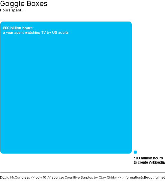
This is crazy isn't it!? Imagine the insane innovations that could advance our society if people just used their brain more. It ridiculous to think that people spent 100 million hours on making Wikipedia the substantiated website it is today. However, its PALES in comparison to the time that people spend watching TV. And that's YEARLY. Now obviously people need a break every now and again to kick their feet back and relax. But if everyone just cut the amount of TV they watched in a quarter (or even a tenth), just imagine all that could be done to fix our fucked up world? World peace? Eliminate hunger? Suffering? Prejudice?
You know you're just itching to be the next Mark Zuckerberg. Then you could have a biographical movie that you didn't approve made about you! Awesome!
Subscribe to:
Comments (Atom)


