Done by their incumbent branding guru Christopher Lukezic (fellow NCAA athlete). Shout out to Berkeley for being the 3rd highest school associated with their bookings.
Ramblings of a retired elite gymnast. Design and sports obsessed account planner. Founder of the Non-Profit AnonyMouse.
Tuesday, September 27, 2011
Airbnb
I pretty neat infographic on AirBnB getting to 1,000,000 reservations.
Wedding of the Painted Doll
Pretty cool video my boyfriend made the other day.
Comedy and style mixed into one. Look out for future videos.
Comedy and style mixed into one. Look out for future videos.
Monday, June 27, 2011
Hell Yeah! Go New York!
Congratulations to the state of New York! They did what California has yet to accomplish (*sigh*).
By passing the marriage equality bill, they effectively DOUBLED the number of Americans who can enjoy same sex marriage! New York's state population is 19,378,102 according to the 2010 US Census. The population of the other five states (Mass, Conn, Iowa, New Hampshire, Vermont) plus Washington equal 15,671,450. Impressive indeed!
On that subject, I thought it'd be a good idea to take a look at how national perceptions of gay marriage have shifted in just one year!

Crazy that youngsters (18-34) changed 16%! In just one year!
With the momentum from New York, expect these numbers to keep exploding! Great news!
By passing the marriage equality bill, they effectively DOUBLED the number of Americans who can enjoy same sex marriage! New York's state population is 19,378,102 according to the 2010 US Census. The population of the other five states (Mass, Conn, Iowa, New Hampshire, Vermont) plus Washington equal 15,671,450. Impressive indeed!
On that subject, I thought it'd be a good idea to take a look at how national perceptions of gay marriage have shifted in just one year!

Crazy that youngsters (18-34) changed 16%! In just one year!
With the momentum from New York, expect these numbers to keep exploding! Great news!
Thursday, June 16, 2011
state names according to twitter
A pretty fun infographic done by design taxi.
Takes all of the names people give to their "location" on Twitter (e.g. NYC = Gotham).
Check out the clever names people've come up with. My personal favorite: "gateway to alaska" and "miami of canada"

Takes all of the names people give to their "location" on Twitter (e.g. NYC = Gotham).
Check out the clever names people've come up with. My personal favorite: "gateway to alaska" and "miami of canada"

Wednesday, June 8, 2011
who's advertising the most
P&G knocks everyone's socks off.
Who're you surprise to see NOT make the list? Microsoft and Sony are a couple that come to mind...

Who're you surprise to see NOT make the list? Microsoft and Sony are a couple that come to mind...

Thursday, April 28, 2011
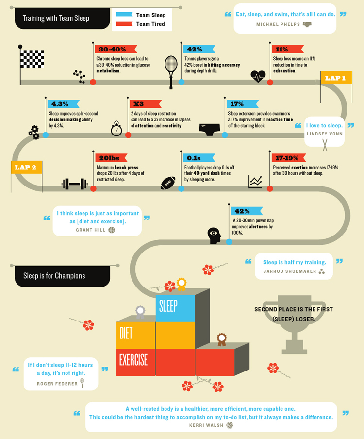
why pro athletes sleep so much
awesome article/infographic by Cliff Kung explaining what happens to athletes if they don't get 10-12 hours of sleep per week:
and another infographic calling out specific athletes and telling how much they sleep.
check out lebron and federer!
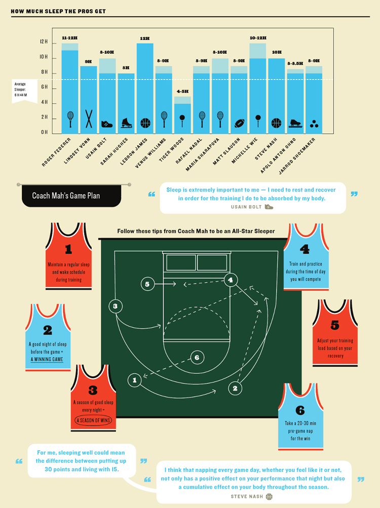
kung finishes the article posing the question - do athlets sleep so much b/c they need to be at their peak at all times. OR do they sleep so much b/c they have more free time than the general population?
I'd go with the former - you'd be surprised at how much athletes need to dedicate to their sport even when they aren't physically working out.

and another infographic calling out specific athletes and telling how much they sleep.
check out lebron and federer!

kung finishes the article posing the question - do athlets sleep so much b/c they need to be at their peak at all times. OR do they sleep so much b/c they have more free time than the general population?
I'd go with the former - you'd be surprised at how much athletes need to dedicate to their sport even when they aren't physically working out.
Tuesday, April 26, 2011
Visual.ly
Really awesome video on the progress infographics have made over the past few years.
Also - a company that dedicates its time to making infographics...AWESOME. Sign me up!
Also - a company that dedicates its time to making infographics...AWESOME. Sign me up!
Friday, April 8, 2011
chromaroma
one of the coolest things i've seen in a long time.
it's sort of like Foursquare, but i'm excited to play it!
Chromaroma from Mudlark on Vimeo.
it's sort of like Foursquare, but i'm excited to play it!
Chromaroma from Mudlark on Vimeo.
Wednesday, April 6, 2011
love is a battlefield
another awesome infographic about relationships. looks very similar to The so-called Sankey Diagram which was made most famous by the astonishing chart of Napoleon's disastrous invasion of Russia during wintertime:
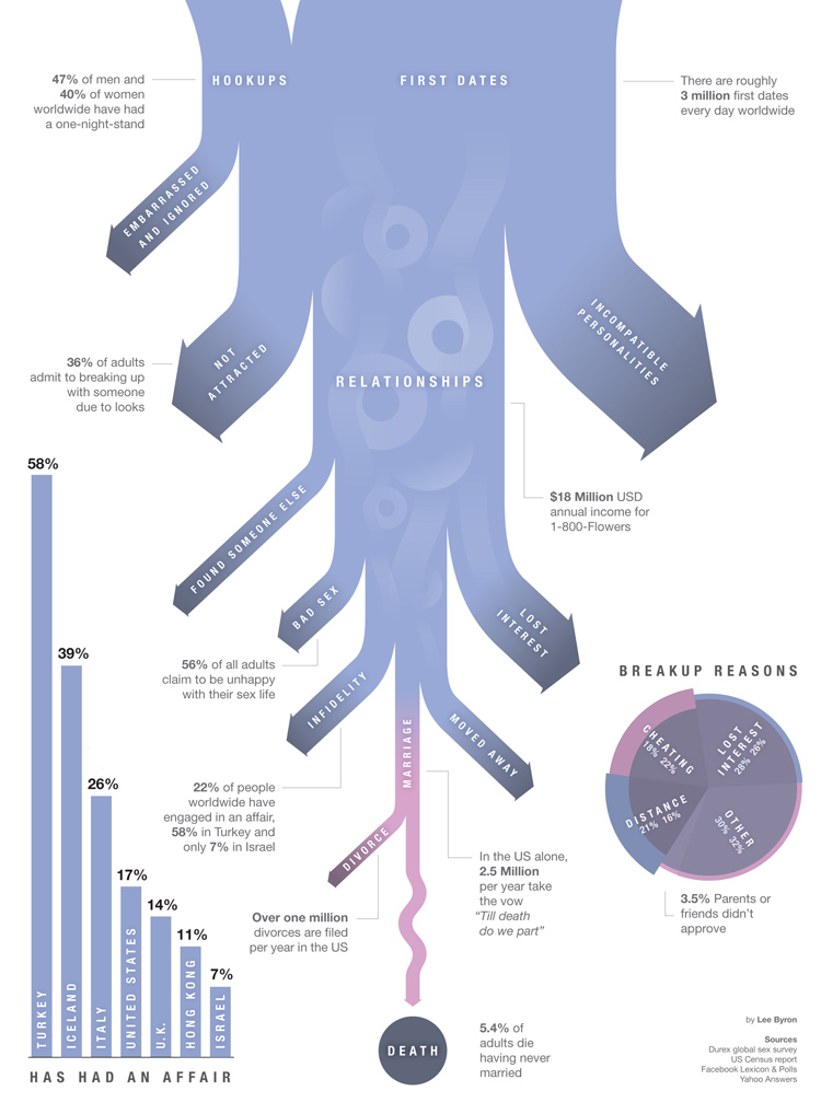
remember - there are 3 million first dates every single day (!)

remember - there are 3 million first dates every single day (!)
Thursday, March 31, 2011
a youthful movement
a really cool infographic by the king of them - GOOD.
looks at young people who move to other countries and which % of them are educated.
the US attracts a lot of young people, but only a small percentage of them are educated (i guess i can be blamed for this as well). Compare that to Singapore which sees 3x as many educated people come in as opposed to those that want to leave.

Click on the link for the bigger picture.
looks at young people who move to other countries and which % of them are educated.
the US attracts a lot of young people, but only a small percentage of them are educated (i guess i can be blamed for this as well). Compare that to Singapore which sees 3x as many educated people come in as opposed to those that want to leave.

Click on the link for the bigger picture.
Wednesday, March 30, 2011
Learn How the Oldest Known Calculator Accurately Predicted Eclipses 2,000 Years Ago
This is one of the coolest things I've seen in awhile. Basically:
Device made in 100 BCE
1901: Wrecked ship discovered with the device
2006: Device's true purpose discovered - predicting celestial events and eclipses with "unprecedented accuracy"
2010: A fully functional replica was made...with Legos!
Check it out for yourself:
Device made in 100 BCE
1901: Wrecked ship discovered with the device
2006: Device's true purpose discovered - predicting celestial events and eclipses with "unprecedented accuracy"
2010: A fully functional replica was made...with Legos!
Check it out for yourself:
Tuesday, March 22, 2011
expensive gas? bah!
sorry for the hiatus - work has been crazy. we just found out we (UM) lost the Microsoft account which we've had for over 19 year. so it was a bit of a bummer. i'm going to keep my head high - look out London here I come!
anyways back to the show - a cool infographic by GOOD on how US gas prices stack up against those around the world... (hopefully it'll make u feel better)

anyways back to the show - a cool infographic by GOOD on how US gas prices stack up against those around the world... (hopefully it'll make u feel better)

Thursday, February 3, 2011
GE dynamic breaking
a really neat video done by GE in their attempts to conserve power from breaking trains.
check it out!
check it out!
Wednesday, January 26, 2011
rent or buy
Trulia put together a cool interactive infograph that tells people which parts of the country have better markets for home buyers.
as GOOD puts it: "The premium we Americans have put on home ownership almost certainly contributed to our current financial crisis, and the myth that you need to own a home to be happy is one that ought to be busted. That said, home ownership seems pretty attainable for people with stable jobs in a few parts of the country."
(click on the picture for the interactive site)
Tuesday, January 25, 2011
profitable concert tours
lady gaga...bon jovi...the eagles...michael buble...
GOOD looks as the top grossing artists of 2010.

GOOD looks as the top grossing artists of 2010.

10 strategies for a strategist
so a bit different post than normal, but i couldn't help but share this insightful article.
mark pollard, who is amazingly intelligent and creative strategist out of Sydney.
he discusses "10 strategies for a strategist’s career – right now"
mark pollard, who is amazingly intelligent and creative strategist out of Sydney.
he discusses "10 strategies for a strategist’s career – right now"
to recap:
1. pick an audience - diversity rocks!
2. build an audience - it's all about the consumer.
3. get experience - live it, love it, learn it.
4. get healthy - opportunities in healthcare.
5. numericise - math is fun! (and useful).
6. IP power move - develop true value...and PUSH IT.
7. like it spicy - move. china. india. latin america.
8. a little something on the side - make stuff. non work stuff.
9. become a digital producer - truly understand digital.
10. start your own company - do it.
Tuesday, January 18, 2011
state foods
a cool little map by "i can haz cheeseburger" about states and the foods most closely associated with them:
click on the link for a blown up version

click on the link for a blown up version

Thursday, January 13, 2011
make it better
a neat little typography video highlighting how the new year will bring about new projects, new goals, and new challenges.
Make it better from Sebastianbap on Vimeo.
Make it better from Sebastianbap on Vimeo.
Monday, January 10, 2011
7 billion
7 billion is a big number.
an awesome video by national geographic to promote their year long series on the world's population.
an awesome video by national geographic to promote their year long series on the world's population.
Friday, January 7, 2011
Subscribe to:
Comments (Atom)


