david mccandless won a Wired competition for finding a better way to visualize severely outdated blood test results. they're tremendously important but tantalizingly annoying and difficult to read.
here's what they used to look like:

and here's what mccandless and his team designed:
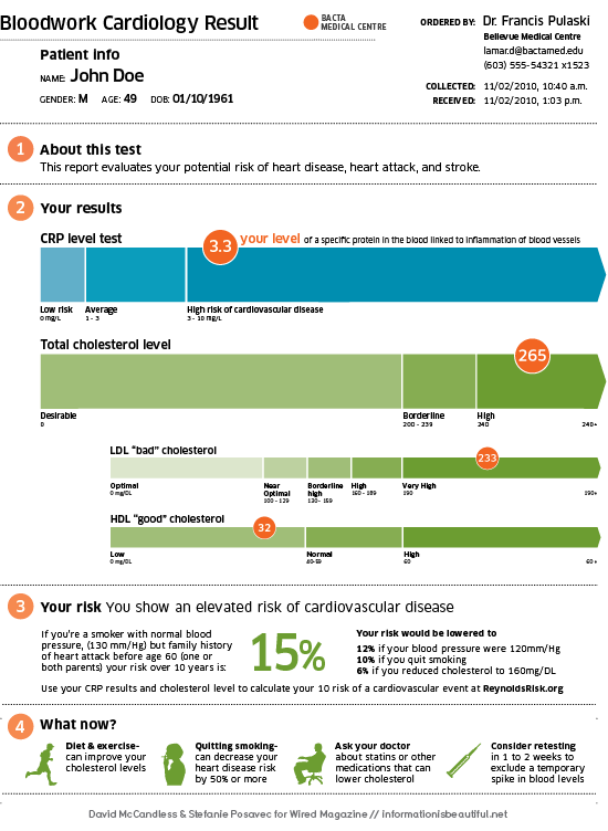
hopefully hospitals and medical centers will use this as their standard means of presenting bloodwork... truly a matter of life and death.
college costs have been soring at a rate higher than that of inflation and medical costs.
2010 marked a landmark in which the first public university hit the $50,000 mark (for out-of-state students) as the University of California-Berkeley increased tuition/room and board costs 6.1% to a whopping $50,649.

a pretty neat visual representation done by an intern at facebook that looks at the relationships that people have to one another globally.

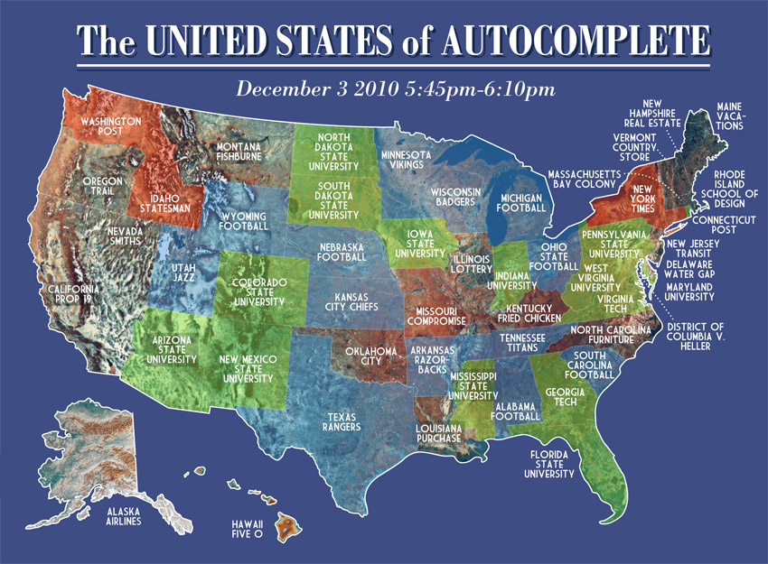
A cool little infographic here about Google's autocomplete.
It maps out all the states and tells you what Google autocompleted when you type in the state's name.